
Most “Art of…” books are filled with lots of great images of early concept work done for a film. Whether it’s little sketch doodles, full color renderings, storyboards, or alternate images, it gives you a glimpse into the development of what you finally see on the screen. But The Art of Sanjay’s Super Team goes beyond most “Art of…” books and delves deep into the story BEHIND the story. Not just writer/director Sanjay Patel’s inspiration for the short film, but also the story of how this film went from concept to finished product.

Title: The Art of Sanjay’s Super Team
Author: Sanjay Patel
Cost: $24.95
Age: 13 and up
Publisher: Chronicle Books
Genre: Non-fiction
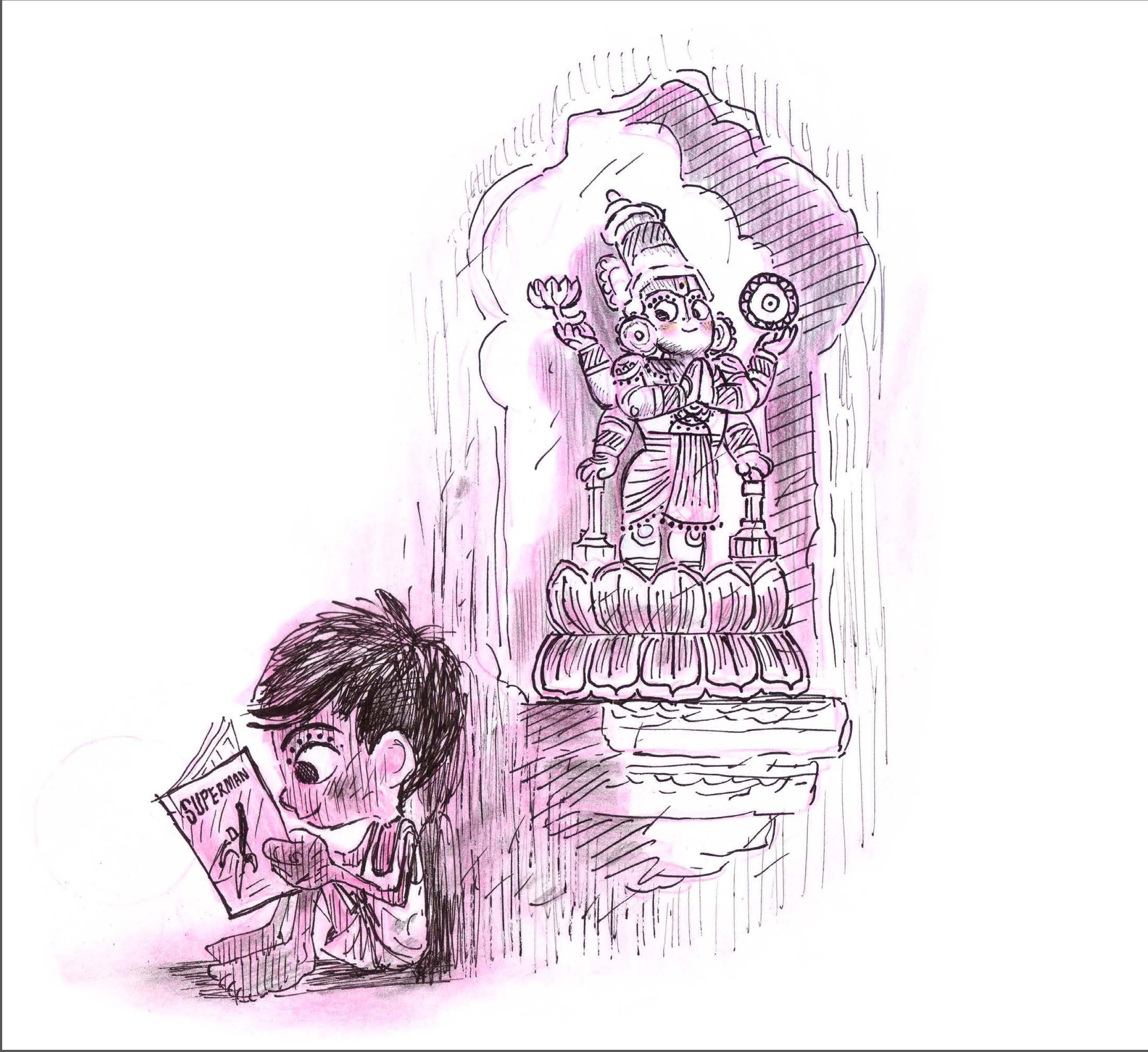
There are so many tidbits and nuggets of information creatively woven throughout the book that nearly every page has something interesting to add to the narrative. It’s not just Sanjay’s voice narrating the book, but instead quotes and quips from different members of his team who worked on it together. Mary Coleman, Creative Development Executive shares that Sanjay had an idea for a short called Temple about a boy who becomes so desperate for his next comic book he decides to steal from the temple’s donation box only to be pulled into the carvings around the temple by a statue of Vishnu. Similar concepts to what eventually developed on the screen, but originally different, too.
Producer Nicole Paradis Grindle shared alternate titles they considered before settling on Sanjay’s Super Team. Turns out they had considered using a more identifiably Hindu name for the title like “Diya” meaning “lamp” or “Darshan” meaning “visions of the divine” but steered away from it to go a more personal route. John Lasseter also warned them about coming across from a religious viewpoint. If there was a concern it would cause a backlash, Disney would likely shelve it.

Every aspect of the short was thoughtfully planned. The layout of the room Sanjay and his father are in, the contrast in color between Sanjay’s world and the world of his imagination, and the 2D renderings of Super Team vs the 3D look of the rest of the short were all taken into account. It was interesting that Chris Sasaki, Production Designer for the film pointed out that they were looking for a “punchy 1970s Super Friends sensibility, but with streamlined details for a modern feel and a clear read on screen (p.52).”
Most “Art of…” books published by Chronicle are in the larger 11 x 9 format, but for The Art of Sanjay’s Super Team it was done in 8 x 8 3/4. Perhaps because it was a “short?” It is such a cute and informative book. If you’re a fan of the short, this will be a treasured book for you. The art is incredible, the stories make you feel like you’re an insider, and the flow of the book is terrific. This is a great book to add to your library.
![]()
![]()
![]()
![]()
![]()
